A month ago on the big summer dyeing day, I dyed the backing fabric for the
Cone Nebula quilt. It came out very bright:
I did a lot of thought experiments, consulted with a friend who is an experienced dyer, and then poked around on a couple of websites before deciding that overdyeing it with a basic blue would fix the brightness without muddying the results too much. My friend suggested
Prochem's Mixing Blue, which I did not have on hand. I had
Dharma Trading's Strong Navy and Royal Blue on hand. I mixed about a two-to-one ratio of the dyes and diluted quite a bit. Once I poured the dye mixture on, I was terrified it was too dark, but I was too nervous to do anything about it.
Today, I washed out the back, ran it through the dryer, and Hubby and I laid it out on the roof of the shed, and then we both said, "Oh, yeah. That's what we want." Here are a couple of beauty shots:
This toned down the glaring colors, deepened the darker areas, and left a great many bright areas. It is much more in keeping with the front of the Cone Nebula quilt.
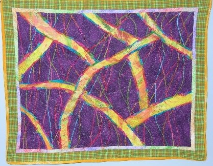
Also, today, I cut apart my favorite screenprinting project, auditioned fabrics for the sashing, and put together a small wall hanging for my office.
I picked the dark green (which was one of the fabrics I was given on my retreat in Ohio in June!) after consulting with Hubby. I then did a really crappy job of the quilting, trimming, and binding. Oh well.
Maybe people will be so dazzled by the pretty screenprints, no one will notice the weird edges. If anyone asks, they're artistic touches!
CORRECTION: In the cold light of morning, I came to my senses and realized that I need to take the binding off, fix the weird trimming by adding another border, and otherwise fixing this up. I do like the piece, but it needs some work.


1 comment:
Liz;
I really like the change to the backing. I can't wait to see the whole thing laid out. I think this is going to be perfect for "The Cone".
Ginia
Post a Comment